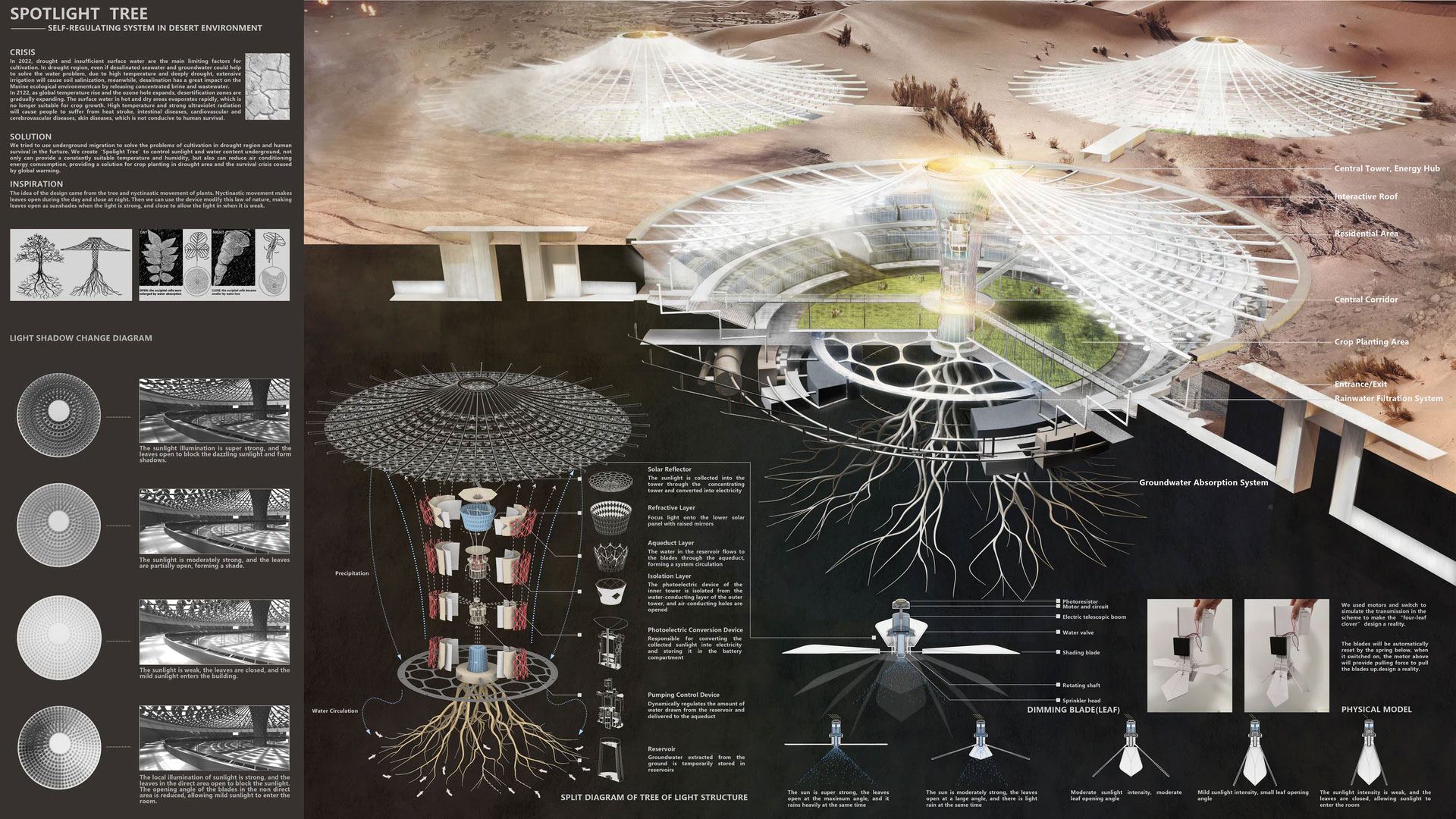
The Color of Time
Category
Daylight in buildings - Region 1: Western Europe.
Students
Marija Kuzevska
Javier Andres Arreola Chapa
Federico Evasio Francisco Condotta
Teacher
Jacopo Gresleri
School
Politecnico di Milano
Country
Italy
Download
Download ↓
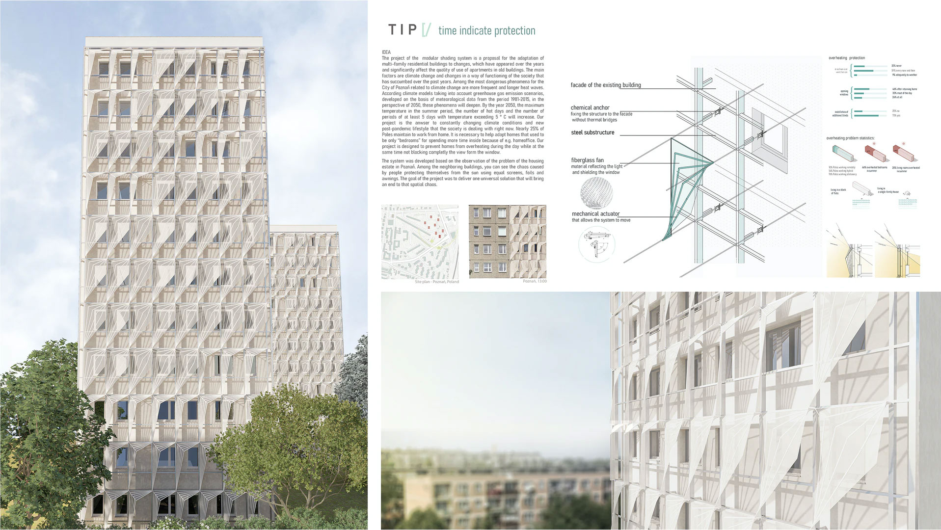
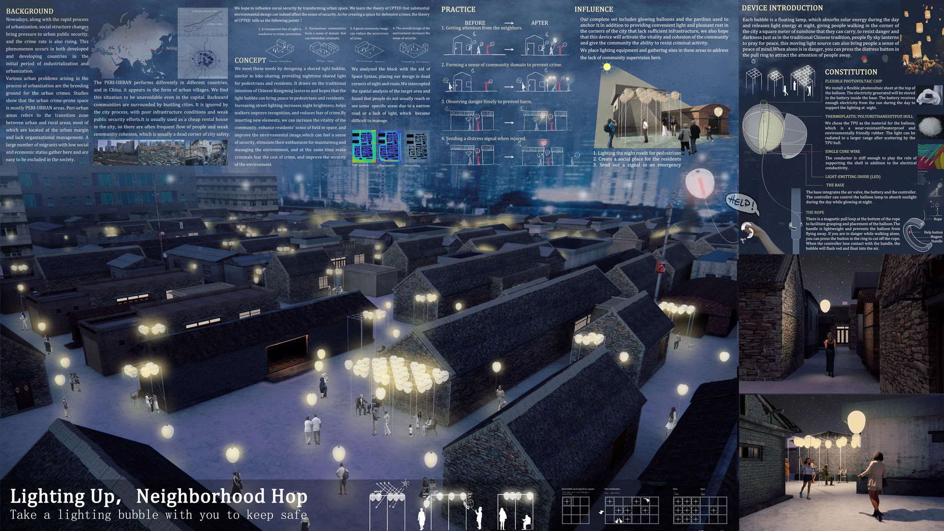
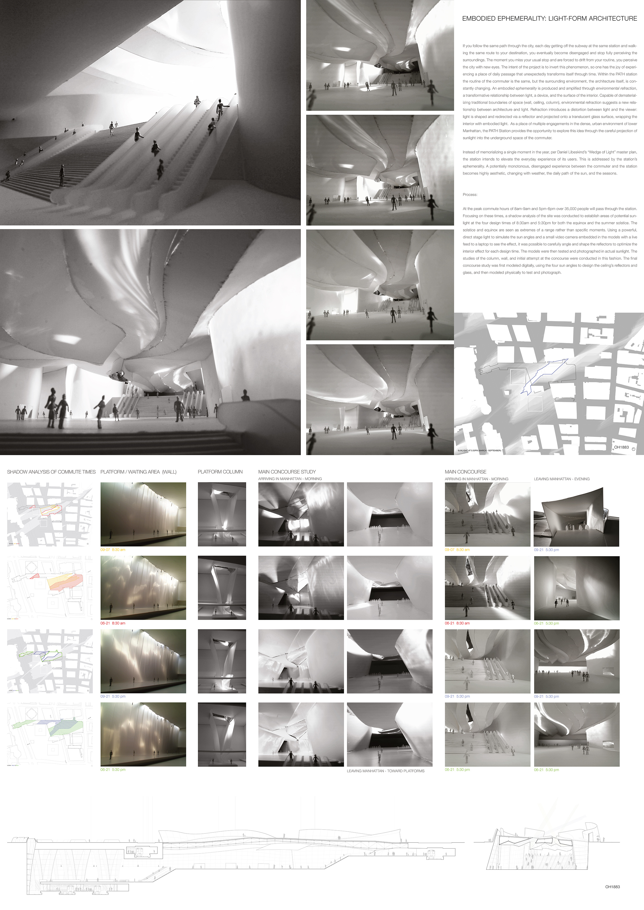
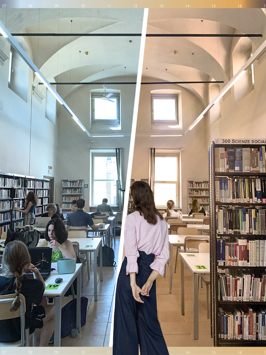
THE COLOR OF TIMEThe relationship between man and time has been anthropologically defined by its connection to light. Light is humanity’s indicator for his or her understanding of the day, the seasons and even its guide for traveling with the stars. Our aim is to create an experience that will allow the used to go into a deeper connection with this relationship. The phenomenological interaction with the different stages of sunlight is a static process exempting the sunrise and sunset. Our focus is placed in creating dynamism in the static stage of the experience. By introducing color, hue, and intensity into the sunlight process, we can effectively break down the stages of the day, assigning a specific color and hue which will evolve hand in hand with the changing of the sun. The user’s indoor day experience will then be attached to a significant visual que, subtle enough to not get in the way of activities, though with sufficient presence to be perceivable almost as something that was always supposed to be there. The dynamic color and intensities reflected in the space will be an accurate representation of the intensity of the sun; hence, it is able to provide a fluid visual response which can be perceived by the user almost without thinking about it. In this way, the mechanical act of looking at a clock will be rendered less significant, as an understanding of the time will be able to be acknowledged, without a single movement or thought.From the Mechanical to the SubconsciousThe device is comprised of 4 elements. A solar-thermal panel, a thin film of plastic which hosts tubing into which the special ethyl liquid can flow through, and a receptacle box to redirect the flow into the original base. The process begins by the heating of the panel with sunlight and UV rays, which will bring the ethyl liquid to a boil due to its special qualities. This same liquid is utilized in a children’s toy (termometro dell’amore) where the colored ethyl moves from its base container to a higher one, only by boiling the liquid with the user’s hand temperature. The device is meant to work utilizing this same principle, only with the addition of hue intensity relative to the sun’s presence in the panel.After boiling, the liquid rises through the hollow plastic where it comes in contact once again with the sunlight, adding color to its rays. The ethyl will then reach the top container, which is limited in its capacity, making the filling of the tubes possible. After the sun stops hitting the heating panel, the pressure difference and gravity will slowly bring the liquid back to its original container, eliminating the color in that particular window, and allowing the following ones (with the device installed) to start their process. The panels are placed in a systematic manner, allowing for the change of color, as the sun hits and passes by the windows in the orientation of the compass. The system of devices is ordered from east to west, recommending that the blue hues be placed in the east, for a more energetic morning, while the orange hues be ordered in the west, giving a soothing afternoon calmness. (The orientations are reversed when going to the south hemisphere).The flexibility of the panels is vast, as they can be utilized to enhance an office experience for increased productiveness, as well as a poetic lighting for a cherished house corner. It is important to highlight that the experiences given are directly connected to the sun’s behavior, the panels are an extension of the sun into the interior of the space, not a digital response to the time in the mechanical clock. Piacenza, a city in northern Italy, is the representative space to showcase the capabilities of the “Color of Time”. A city filled with international students, coming from all places of the world to learn and experience university life. In the city library, where many gather to study and enjoy a good book, we have imagined an intervention where the windows which are facing the 4 cardinal orientations are taking full advantage of the project. The space is illuminated by blue hue in the mornings, increasing the quality of readability and energy, and as the closing time gets closer (7 pm), the hue will begin to give a romantic and calming feeling to residents of the space. The goal of the Color of Time is to give a practical use to perceive time in a new way, at the same time that we create a livable, beautiful environment for the users around the globe.